Scrolling Content
Handle scrolling content within the bottom sheet.
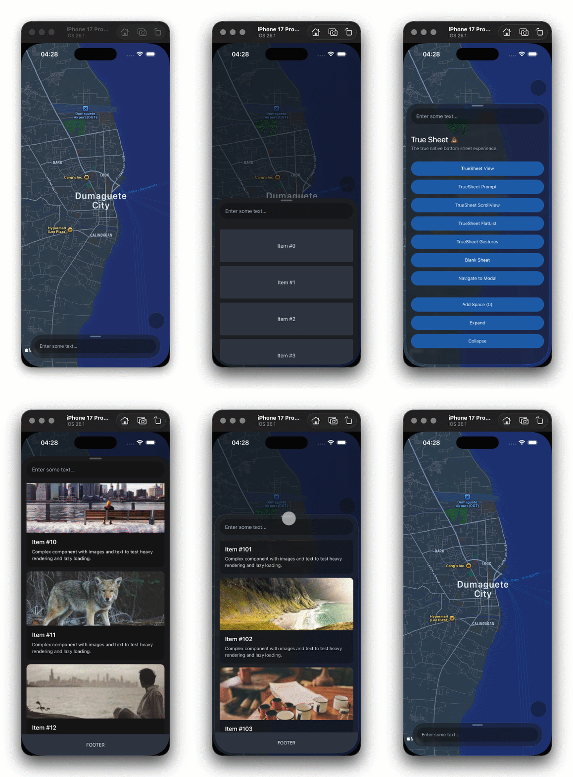
Scrolling content within the sheet works like a regular view — bound the scroll view's height with flex: 1, plug a ScrollView or FlatList in, and point the sheet at it with scrollableRef.
How?
Pass a ref of your scroll view (including ScrollView and FlatList) to the sheet via the scrollableRef prop. Keyboard handling and nested scrolling are then wired for you.
Like any scroll view in React Native, it needs a bounded height to scroll. Pass flex: 1 via the sheet's style prop so the content fills the sheet's visible height per detent — resizing in realtime while dragging:
const App = () => {
  const sheet = useRef<TrueSheet>(null)
  const scrollableRef = useRef<ScrollView>(null)

  return (
    <TrueSheet ref={sheet} scrollableRef={scrollableRef} style={{ flex: 1 }} detents={[0.5, 1]}>
      <ScrollView ref={scrollableRef}>
        <View />
      </ScrollView>
    </TrueSheet>
  )
}
The scroll view doesn't have to be a direct child — wrapping it in a container View works too:
<TrueSheet scrollableRef={scrollableRef} style={{ flex: 1 }} detents={[0.5, 1]}>
  <View style={{ flex: 1 }}>
    <View>{/* Header content */}</View>
    <FlatList ref={scrollableRef} data={data} renderItem={renderItem} />
  </View>
</TrueSheet>
On Android, nested scrolling is managed internally — any nestedScrollEnabled prop on your ScrollView or FlatList is ignored. RefreshControl is also fully supported.
The auto detent works with scrolling content too — no flex: 1 needed. The sheet sizes to the scroll view's content height and resizes as content grows or shrinks, while the viewport is automatically bounded to the sheet's visible height.
Bottom Safe-Area Inset
The sheet applies the bottom safe-area inset to your scroll content automatically while the content can scroll — the last item clears the home indicator (iOS) and navigation bar (Android):
- iOS: The scroll view's native
contentInsetAdjustmentBehavioris set toautomaticwhile it's plugged into the sheet — no need to set React Native's iOS-only prop yourself. - Android: The inset is applied as content padding, mirroring iOS's
automaticbehavior — parity React Native's iOS-only prop can't provide. - Web: The content is lifted above the safe area (
env(safe-area-inset-bottom)).
To opt out and manage the padding yourself, set contentInsetAdjustment to 'never' (or 'footer' to keep the footer inset) in scrollableOptions:
const insets = useSafeAreaInsets()

<TrueSheet
  scrollableRef={scrollableRef}
  scrollableOptions={{ contentInsetAdjustment: 'never' }}
>
  <ScrollView ref={scrollableRef} contentContainerStyle={{ paddingBottom: insets.bottom }}>
    <View />
  </ScrollView>
</TrueSheet>
This only applies while the sheet's insetAdjustment is 'automatic'. If the sheet has a relative footer, the footer absorbs the bottom inset instead — the scroll view ends above it, so no padding is needed.
Footer Inset
An absolute footer floats over the content, covering the bottom of the scroll view. The sheet pads the scroll content by the footer's measured height automatically — the last item scrolls into view above the footer, and the footer counts toward the auto detent so the content ends above it when the sheet is sized to its content. No paddingBottom: FOOTER_HEIGHT needed:
<TrueSheet
  detents={['auto', 1]}
  scrollableRef={scrollableRef}
  footer={<Footer />}
  footerOptions={{ position: 'absolute' }}
>
  <FlatList ref={scrollableRef} data={data} renderItem={renderItem} />
</TrueSheet>
Only the part of the footer that overlaps the scroll view is applied — a short scroll view that ends above the footer gets no inset. The bottom safe-area inset the footer absorbs is not counted twice, and while the keyboard is open the inset stacks with the keyboard inset as the footer rises above it.
To let the content scroll under the footer instead, set contentInsetAdjustment to 'safe-area' (keeps the safe-area inset) or 'never':
<TrueSheet
  scrollableRef={scrollableRef}
  scrollableOptions={{ contentInsetAdjustment: 'safe-area' }}
  footer={<Footer />}
  footerOptions={{ position: 'absolute' }}
>
  <FlatList ref={scrollableRef} data={data} renderItem={renderItem} />
</TrueSheet>
This only applies with footerOptions.position set to 'absolute'. A relative footer sits below the content, so the scroll view already ends above it. Unlike the safe-area inset, it doesn't depend on the sheet's insetAdjustment — the footer covers the scroll view either way. Remove any manual paddingBottom for the footer from your content, or it doubles up.
Preventing Scroll-to-Expand
By default, scrolling content to the top edge expands the sheet to the next detent. To disable this (e.g., for YouTube-style comments sheets where only the grabber should expand the sheet), set scrollingExpandsSheet to false:
<TrueSheet
  scrollableRef={scrollableRef}
  scrollableOptions={{ scrollingExpandsSheet: false }}
  detents={[0.5, 1]}
>
  <ScrollView ref={scrollableRef}>
    <View />
  </ScrollView>
</TrueSheet>
On iOS, this uses prefersScrollingExpandsWhenScrolledToEdge. On Android, a custom BottomSheetBehavior selectively blocks scroll-driven expansion while preserving normal scrolling, fling deceleration, and grabber-based dragging.
Scroll Edge Effect
On iOS 26+, you can apply a blur/gradient edge effect on the header and footer when content scrolls behind them. This uses UIScrollEdgeElementContainerInteraction under the hood.
Set topScrollEdgeEffect and/or bottomScrollEdgeEffect in scrollableOptions to enable it:
<TrueSheet
  scrollableRef={scrollableRef}
  scrollableOptions={{
    topScrollEdgeEffect: 'automatic',
    bottomScrollEdgeEffect: 'soft',
  }}
  header={<Header />}
  footer={<Footer />}
>
  <ScrollView ref={scrollableRef}>
    <View />
  </ScrollView>
</TrueSheet>
Available values: 'automatic', 'hard', 'soft', or 'hidden' (default). See ScrollEdgeEffect.
This also controls the scroll view's own edge effects (UIScrollEdgeEffect). topScrollEdgeEffect applies to both the header interaction and the scroll view's top edge, and bottomScrollEdgeEffect applies to both the footer interaction and the scroll view's bottom edge.
This feature requires iOS 26 or later. On older versions, these options are ignored.